
The first comps for a poster which we prepared for our client, T. A. Sciences.
Once you’ve agreed to start with us, we take your desires, precisely expressed in the Creative Proposal and turn them into reality. The first step is to deliver rough design ideas (called comps).

For the second comp the client requested animated video frames to be inserted.
Meeting with you, we modify the comps and try different ideas. When you are sure that the design is right for you, we are ready to write the text and acquire the right photos and graphics. If we were building a house, we could say the frame was done. As previously agrees we now lock the design from further changes.
If you’ve provided us the text, graphics and photos, we insert them into this frame – or – if you’ve contracted us to write and acquire art we then supply these elements. Once done, you get another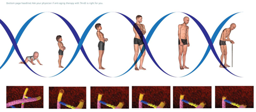
- This comp really got the client excited. Click on the T. A. Sciences Icon below to see the final poster.
level of approval – we have a copy-art lock. Certainly, small, final adjustments can still be made at this stage, but your final approval is required to commit the design to the printer.
And yet, before the printer is allowed to start, she gives us a full-color proof copy, just to make sure you are totally satisfied. Only with your “final proof approval” do we take the final step and commit to print the job – a little later – deliver the final results to you.
See some examples of print projects we have designed and produced. GET YOURS: 212-308-8000
ABB Energy Ventures
This brochure launched a new division for the Swedish multi-national firm, ASEA Brown Boveri. ABB is best known for developing power plants around the world. This brochure was the first time the word "terawatt" was used in a publication as a definition of the entire planet's electrical energy output, and helped define the firm as a conceptual innovator.

New York Military Academy
One of the few remaining military high schools in the US, New York Military Academy is located only a few miles from West Point and an accepted feeder school to USMA. Still, like any the institution, NYMA requires aggressive marketing on many fronts. Our work for NYMA includes this brochure, numerous videos, DVDs and website designs.
Organon Div. of Merck
We have produced a number of imarketing communications assignments for Organon, a major pharmaceutical innovator headquartered in the Netherlands. This package design was created to enclose a video, booklet and medical information informing consumers of new developments in treating infertility using recombinant DNA.

American Insurance Group
AIG launched a new division, dedicated to providing insurance to the Internet industry, from large backbone infrastructure firms to mom-and-pop Ebay shops. Avekta produced the launch media for the new division, which included an interactive CD. To keep the theme consistent, Avekta also designed and printed the disk's face and clear plastic packaging.

T. A. Sciences
This poster was designed to be displayed in physicians' waiting rooms. It depicts the stages of human aging, along with high definition renderings of the stages of age in the human DNA strand undergoing similar deterioration. Text, which Avekta wrote, accompanies the drawings and inform the viewer that new anti-aging drugs are available.

Architectural Window Manufacturing
Our client makes aluminum windows for new construction and restoration. We redesigned their logo, letterhead, website and brochures after a new theme, "Reflect the past. Design the future." To illustrate this theme, we created a composite photo of two recent projects, NY's Plaza Hotel and NJ's Crystal Point.

100 West 18th Street
The Brauser Group, contracted Avekta to use Softimage, an animation program used to create realistic movie animation, to create extremely realistic renderings of a condominium, months before construction. Our designs were fundamental to the ad agency's brochure and street signage, and assisted the architect in refining his designs.

Simply Chic Interiors
New York Interior designer, Alissa Jo, wanted to add retail sales of the furnishings she employs in her interior designs. Our idea was to offer a direct mail campaign offering 15% off and targeted to a demographic of young, urban, housewives. A designer herself, AlissaJo suggested the color theme and supplied photos of some of her work. We did the rest.


 LinkedIn
 YouTube
